
Contributed by: Seppe vanden Broucke
This article first appeared in Data Science Briefings, the DataMiningApps newsletter. Subscribe now for free if you want to be the first to receive our feature articles, or follow us @DataMiningApps. Do you also wish to contribute to Data Science Briefings? Shoot us an e-mail over at briefings@dataminingapps.com and let’s get in touch!
Every data scientist is familiar with the following situation: after months of tedious data pre-processing, deciding on an appropriate predictive technique and tuning hyper-parameters, your finished model obtains a high result on your test set. You’re ready to deploy your model, right? Not so fast! A look at CRISP-DM (or any other similar data science standard process) reveals the link from evaluation to business understanding. Before deploying your model, an important step entails the reporting of both your model’s insights and workings to business stake holders that will end up validating and utilizing the model.
If you’re familiar with this situation, you are probably aware of the large number of questions that arise in this context. Common examples include:
- Why does the model make mistakes?
- Which attributes end up being important?
- Why is this attribute not important?
- Why does this instance get a high probability score?
It is well known that a trade-off exists between predictive accuracy and explainability of predictive techniques [1], and providing answers to such questions is hard when using black-box models (random forests, gradient boosting machines, neural networks) that are good at predicting, but do not provide answers to questions like the ones above “for free.”
Hence, opening black-box models in order to answer questions like the ones listed above is an important step before pushing them to deployment. Not only will it prepare you to provide answers to questions from stake holders regarding the model, which will be a great tool to gain acceptance and trust, it will also help you to understand the strengths, weaknesses and sensitivities of the model. In most organization settings, especially where a data-oriented culture is still growing, going through these explanatory steps to gain trust is crucial. If users don’t trust a model, they won’t use it, no matter how well it predicts.
Luckily, tools exist that can help to perform such interpretability checks on models. Below, we take a look at five common interpretability checks that you should embed in your evaluation step. The benefit of these it that they all work in a “model agnostic” way, meaning that you can apply them on any predictive technique.
We’ll demonstrate the techniques using code fragments for Python and scikit-learn, though implementations for all listed techniques exist for R as well.
Take a close look at evaluation metrics and model outputs
The first check you can perform boils down to making sure you have taken a good, solid look at your evaluation metrics and contrast them with the application setting your model will be applied in. For instance, it is common to evaluate and rank different classifiers and classifier configurations using the area under the receiver operating characteristic (ROC) metric. However, it is important to note that this metric is calculated over the whole range of the ROC. In many application settings, probability outputs from a classifier will be used to effectively rank instances to create a shortlist with a focus on precision, meaning that the aim is not necessarily to correctly identify all positive instances, though to avoid labeling negative instances as being positive. In the case of churn prediction, for instance, there is commonly a limited budget restricting the number of true positives that can be contacted or otherwise incentivized, and misclassifying a negative case as positive might lead to wasted efforts and costs.
As an example, consider the ROC curves of two models below:
The red model has a higher AUC value, though performs worse in terms of recall when considering that one would only accept a false positive rate of 10% (the blue vertical cutoff line; in some settings, this might be even lower). As such, in these settings, consider evaluating based on more appropriate fine-grained metrics such as lift score, an AUC value constrained on [0, desired FPR] or [1, desired TPR], or a weighted F-score.
Taking a closer look at your ROC curves and evaluation metrics will help to convert the underlying business goals of a modelling exercise to effective evaluation metrics you should use to evaluate classifiers. Additionally, it is also worthwhile to convert the insights gained from inspecting the ROC curve back to an effective cutoff threshold for the classifier’s probabilities. This is particularly useful in settings where the shortlist produced by the model does not have a fixed length, in which case a threshold can be established so that, for example, within all predictions that fall above this threshold, we can expect at most n% false positives.
No model is perfect. A large part of the evaluation step in the data science process also boils down to expectation management and explaining where and why the model makes mistakes, and whether these mistakes are reasonable. An easy approach to do so is by doing some instance-level spot checks based on the models output and the true target value. Consider for instance a typical confusion matrix, constructed after having chosen a representative threshold value:
The results of this particular model look solid, though the model is not 100% perfect. To justify the model to end users, it is a good idea to select instances from the four quadrants based on where the model was “most confused” or “most sure”, and idea popularized by e.g. fast.ai, e.g. as follows:
def most_confused(y_score, y_test, predicted, actual, sort=1, n=10, threshold=0.5):
    idx = np.argwhere(
        (((y_score[:, 1] >= threshold) & (predicted == 1)) |
         ((y_score[:, 1] <  threshold) & (predicted == 0))) &
        (y_test == actual))
    res = np.hstack((idx, y_score[idx, 1]))
    return res[res[:,1].argsort()][::sort][:n]
This function returns the indices of the instances and probabilities based on the predicted outcome and actual outcome (e.g. the position in the confusion matrix).
For instance:
most_confused(y_score, y_test, predicted=1, actual=1)

# Outputs:
array([[ 52.  ,   0.5 ],
       [136.  ,   0.51],
       [ 25.  ,   0.6 ],
       [108.  ,   0.61],
       [ 44.  ,   0.65],
       [179.  ,   0.65],
       [ 12.  ,   0.66],
       [134.  ,   0.66],
       [112.  ,   0.69],
       [186.  ,   0.7 ]])
returns a list of true positive instances, sorted ascending by probability. Here, it is a good idea to inspect instances that fall right above the threshold (here 0.5). These are instances where the model was quite unsure about (i.e. they fall close to the decision boundary). Similarly, by sorting in descending order, we get the true positive instances where the model was most sure about. Check the features of these instances and confirm whether their values match with your domain knowledge or business intuition.
Similarly, one can also inspect the mispredictions of the model. For instance, take a look at the false positives (there are six in this example), ordered by probability in descending order:
most_confused(y_score, y_test, predicted=1, actual=0, sort=-1)

# Outputs:
array([[ 20.  ,   0.86],
       [148.  ,   0.58],
       [ 82.  ,   0.53],
       [100.  ,   0.5 ],
       [ 84.  ,   0.5 ],
       [ 36.  ,   0.5 ]])
Instance 20 here is hence where the model is “most confused.” Again, make sure to take a look at these instances and verify them. Are these indeed particularly difficult instances? Would they be hard to classify for human end users? Perhaps it might also be the case that this was a mislabeled instance.
It is always a good idea to take a close look at your model’s outputs and link them back to the data, even on the level of particular instances, as seen above. An important aspect to consider here is to make sure to present these findings in an easy to understand manner to non-data-oriented practitioners. For instance, a small Excel spread sheet listing the most representative true positive, false positive, … instances with their attributes is a good starting point.
Finally, note that this says something about for which instances the model is e.g. most confused, but nothing about the particular features it based its decision on. To do so, we need to incorporate the techniques described below.
Finally, not that other example based explanation techniques exist, for instance by deleting instances one-by-one and retraining the model to look for influential instances [2], or by performing small perturbations on a selected instance to check how the model’s output shifts around (a setting close to adversarial learning [3]). Another related extension is to find the smallest perturbation (so that it can be easily explained) that shifts the predicted label [4]. A technique which combines insights from these approaches is LIME.
LIME
LIME stands for “local interpretable model-agnostic explanations” and proposes a simple idea to understand why a model has made a particular prediction for a particular instance. As such, it can be directly used as an extension for the analysis above.
LIME generates a new dataset consisting of permuted samples around an instance of interest and queries the model to predict for those instances. Next, an interpretable (commonly a regression) model is trained only on this data set (with the black-box predictions as the target) to help explain the local decision boundary of the black-box classifier. The following image shows a local decision boundary to explain to bold “+” instance.
Using LIME in Python is easy (for instance to get explanations for test instance number 20, which are model was most confused about):
import lime
import lime.lime_tabular

explainer = lime.lime_tabular.LimeTabularExplainer(
    X_train.values, feature_names=X_test.columns,
    discretize_continuous=True, verbose=True)

exp = explainer.explain_instance(X_test.iloc[20, :], predict_fn=model.predict_proba,
                                 num_samples=100, num_features=2)

print(exp.as_list())
exp.show_in_notebook(show_table=True, show_all=True)

# Outputs:
Intercept 0.6099215418731894
Prediction_local [0.78483048]
Right: 0.86
[('mean texture <= 16.17', 0.116465093635808),
 ('0.09 < mean smoothness <= 0.10', 0.05844384531031987)]
Again, like above, LIME can help to verify whether your model is looking at the right features, as well as explaining why it predicts a certain outcome for a certain instance.
As stated above, LIME creates variations of a chosen instance by creating new samples by perturbing each feature individually. LIME can also be used for image data (by modifying pixels) and text (by turning words on or off). However, it is important to note that LIME also weights the created instances around the instance under observation in the white-box explainer. By default, LIME uses an exponential smoothing kernel to define a proximity measure between pairs of instances. By default, the size of this kernel is set to 0.75*sqrt(number of features), though there is no guarantee that this default always works. In many cases, you can even turn the explanations around by changing the kernel width. Additionally, distance in different dimensions (features) might not be comparable at all.
This makes that LIME is quite tricky to use correctly for tabular data, and care should be taken when using it. (As a side note, given enough training data, one might also opt for a kNN-inspired approach where, instead of creating permuted samples, we just take the k nearest samples from the one under observation instead – where the weighting procedure can still be applied. This is not implemented in LIME, though can be easily manually set up by (1) selecting an instance, (2) selecting nearby instances based on a distance metric, (3) construct a simple regression model, optionally weighting instances by using e.g. the “sample_weight” parameter in the “fit” method of scikit-learn’s Ridge model, (4) inspecting the coefficients of the regression model.)
However, we can also resort to a somewhat manual permutation-based approach through a simple optimization method. We utilize fmin_l_bfgs_b to find a perturbation vector that brings us closes to the goal probability (since the original probability for instance 20 is 0.86, say we want to go towards a goal of 0). To keep the perturbation vector under control, we utilize a lasso-inspired regularization norm with an alpha parameter. Finally, we will also check whether some elements of the resulting perturbation vector can be set to zero based on a threshold and whether this also “flips the probability” around, leading to a sparse permutation vector.
from scipy.optimize import fmin_l_bfgs_b

instance = X_test.iloc[20, :].values

def explanation_loss(x, instance, predict_fn, alpha, goal=0):
    perturbed = instance + instance * x
    init = predict_fn(instance.reshape(1, -1))[0]
    prob = predict_fn(perturbed.reshape(1, -1))[0]
    diff = np.abs(prob[1] - goal)
    return diff + alpha * np.abs(x).sum()

x0 = np.zeros((len(instance)))
result, f, warn = fmin_l_bfgs_b(explanation_loss, x0,
         args=(instance, model.predict_proba, .3),
         bounds=[(-2, 2) for x in range(len(instance))],
         epsilon=1e-01, approx_grad=True, maxls=100)

zeroed_result = np.array(result)
zeroed_result[np.argwhere(np.abs(zeroed_result) < 0.1)] = 0
new_instance = instance + instance * result
new_instance_sparse = instance + instance * zeroed_result

pd.DataFrame({'original': instance, 'permutated': new_instance,
              'sparse': new_instance_sparse}, index=X_test.columns)
| original | permutated | sparse (only bold features permuted) | |
| mean radius | 13.80000 | 13.977342 | 13.800000 |
| mean texture | 15.79000 | 20.210695 | 20.210695 |
| mean perimeter | 90.43000 | 93.325001 | 90.430000 |
| mean area | 584.10000 | 546.841326 | 584.100000 |
| mean smoothness | 0.10070 | 0.103281 | 0.100700 |
| mean compactness | 0.12800 | 0.119173 | 0.128000 |
| mean concavity | 0.07789 | 0.077209 | 0.077890 |
| mean concave points | 0.05069 | 0.063490 | 0.063490 |
| mean symmetry | 0.16620 | 0.155630 | 0.166200 |
| mean fractal dimension | 0.06566 | 0.061116 | 0.065660 |
model.predict_proba(new_instance_sparse.reshape(1, -1))

# Outputs:
array([[0.73, 0.27]])
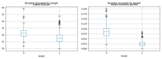
Based on the above, we see that the model’s prediction for instance nr. 20 (our most confused false positive) can now be explained: if the mean texture value would be higher by about 5 and mean concave points would be higher by about 0.01, the prediction of the model would switch from 0.86 to 0.27.
When looking at the data, we see that this makes sense, and that this instance was indeed a particularly tricky one to get right based on those two features:
Feature importance ranking
Feature importance rankings are another very common approach to explain how a model works. Several approaches to calculate feature importance rankings exist (based on dropping a feature and retraining the model, based on permutations, or based on mean decrease in impurity – which is model-dependent). We focus here on permutation importance, as it is the most appropriate one in practice. The idea is simple: for each feature, generate a new feature matrix by permuting that feature and leaving the others alone. By permuting, we mean here that we randomly “shuffle” that feature around, not that we add a sampled noise factor. Next, we ask the model to predict on this new feature matrix, and see for which features the predictions have deviated the most. (As a side note: one could make the case for filling up the feature under observation by creating a uniformly generated random values, or by replacing the feature under observation by the median/mode, similar to how partial dependence plots work (see below). However, this approach is rarely adopted in practice.)
Feature importance plots are commonly used to get an initial idea regarding which features end up being most important in the model. This is used to communicate results, and – in some cases – as a feature selection approach as well.
In scikit-learn, feature importance plots can – at first sight – be easily constructed when working with a random forest based model:
fi = model.feature_importances_
fig, ax = plt.subplots()
ax.bar(range(len(fi)), fi, align="center")
ax.set(xticks=range(len(fi)), xticklabels=X_train.columns)
plt.setp(ax.get_xticklabels(), rotation=45, ha="right", rotation_mode="anchor")
plt.show()
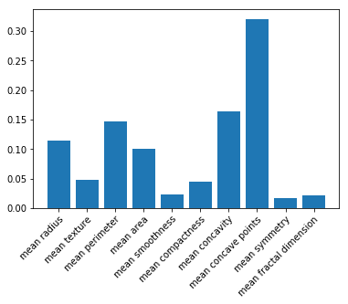
Given scikit-learn’s implementation, some practitioners believe that feature importance plots can only be constructed for random forest based classifiers and regressors. This is true when using feature importance based on mean decrease in impurity (which scikit-learn uses), but definitely not when using permutation-based importance! Therefore, use a package like rfpimp, which works on models other than random forest:
imp = importances(model, X_train, y_train, n_samples=-1)
viz = plot_importances(imp)
viz.view()
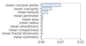
There is another reason why you absolutely need to use permutation-based feature importance: the mean decrease in impurity-based feature importance can lead to biased results [6], and can even cause randomly generated features to get a high feature importance result.
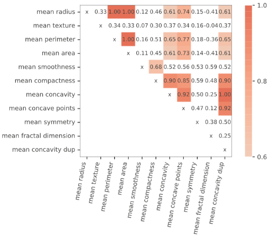
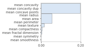
Even when using permutation importance, it is important to know that importance score might be under-estimated in case features are correlated or when interaction effects are present. For instance, the following figure illustrates what happens when we duplicate the “mean concavity” column:
X_train_dup = X_train.copy()
X_train_dup['mean concavity dup'] = X_train_dup['mean concavity']

model_dup = RandomForestClassifier(n_estimators=100, random_state=42)
model_dup.fit(X_train_dup, y_train)

imp = importances(model_dup, X_train_dup, y_train, n_samples=-1)
viz = plot_importances(imp)
viz.view()
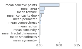
As such, take care when inspecting feature importance plots, and make sure to contrast them with a correlation analysis. Again, the rfpimp package provides tools to do so, by permuting correlated variables together (and keeping their values together during the shuffling):
viz = plot_corr_heatmap(X_train_dup, figsize=(7,5))
viz
imp = importances(model_dup, X_train_dup, y_train, n_samples=-1,
                 features=[
                     ['mean radius', 'mean area', 'mean perimeter'],
                     ['mean concavity', 'mean concavity dup', 'mean concave points'],
                     ['mean symmetry'], ['mean smoothness'], ['mean compactness'], ['mean texture']])
viz = plot_importances(imp)
viz.view()
Note that a similar skewed view can occur for features that are involved in a strong interaction with other features. Uncovering interaction effects from black-box models is, generally speaking, not trivial. One method to uncover these consists of using the Friedman H-statistic [7,8]. Two-way interaction effects can, however, quite easily be uncovered by using individual conditional expectation plots (see below).
Note that, given the presence of an interaction effect, it is also possible to estimate the importance of e.g. two features together by applying the permutation “shuffle” on more than one column, like for correlated features as shown above.
Partial dependence and individual conditional expectation plots
Partial dependence plots are another interpretability tool that are commonly assumed to work only with random forest based models, though they are really model agnostic as well. Again, the idea is quite simple: given a feature we want to inspect, construct a new feature matrix with all features except the feature under observation being set to their median or mode value, so that only the values for the feature under observation will differ over the instances. Typically, the values are set in a range from the minimal to maximal observed value, or simply the distinct values observed in the training data.
The idea is then to plot the model’s probability (or the marginal effects on the outcome) for each created instance. The basic intuition is hence: given everything being “the average case” except for this one feature, how does the model react.
The current versions of scikit-learn only allow to plot partial dependencies for gradient boosted models – again causing some practitioners to assume this method is not model agnostic (this is changing in an upcoming version of sckikit-learn), so it is recommended to use the excellent pdpbox package.
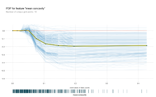
The following figure shows the partial dependence plots for the “mean concavity” feature:
pdp_res = pdp.pdp_isolate(
    model=model, dataset=X_train, model_features=X_train.columns, feature='mean concavity'
)
pdp.pdp_plot(pdp_res, 'mean concavity')
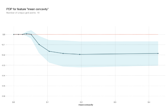
Knowing which features is important is useful, though typically you also want to know how exactly different values influence the predictive outcome. Since black-box models are typically able to capture non-linear relationships, these plots form a useful approach to identify hot zones in your features for which the predictions shoot up or down.
Just as with feature importance rankings, partial dependence plots work in a univariate setting so that certain dependencies might not show up for a particular feature if a strong interaction is present with another feature. A good rule of thumb is thus to not assume there is no effect in case a flat partial dependence plot is shown.
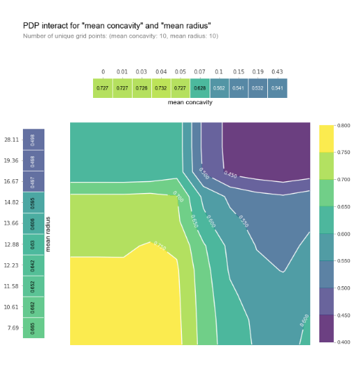
To overcome this issue, it is also possible to plot partial dependence plots for two features at once:
from pdpbox import pdp_plot_utils

# Override to fix matplotlib issue
def _pdp_contour_plot_override(X, Y, pdp_mx, inter_ax, cmap, norm, inter_fill_alpha, fontsize, plot_params):
    contour_color = plot_params.get('contour_color', 'white')
    level = np.min([X.shape[0], X.shape[1]])
    c1 = inter_ax.contourf(X, Y, pdp_mx, N=level, origin='lower', cmap=cmap, norm=norm, alpha=inter_fill_alpha)
    c2 = inter_ax.contour(c1, levels=c1.levels, colors=contour_color, origin='lower')
    inter_ax.clabel(c2, fontsize=fontsize, inline=1)
    inter_ax.set_aspect('auto')
    return c1

pdp_plot_utils._pdp_contour_plot = _pdp_contour_plot_override

pdp_inter = pdp.pdp_interact(
    model=model, dataset=X_train, model_features=X_train.columns, features=['mean concavity', 'mean radius']
)

fig, axes = pdp.pdp_interact_plot(
    pdp_interact_out=pdp_inter, feature_names=['mean concavity', 'mean radius'], plot_type='contour',
    x_quantile=True, plot_pdp=True
)
A very similar alternative technique is individual conditional expectation (ICE) plots. Here, the idea is that we visualize the dependence of the prediction for a feature under observation for each instance separately. We do not create an “average instance”, but plot a line for each observation where all features are kept as-is, except for the feature under observation, where we again slide over different values and query the model. It is common practice to center the ICE lines at the zero-point and plot an average over the lines. This approach is better suited to spot possible interaction effects.
pdp_res = pdp.pdp_isolate(
    model=model, dataset=X_train, model_features=X_train.columns, feature='mean concavity'
)

pdp.pdp_plot(pdp_res, 'mean concavity', plot_lines=True, plot_pts_dist=True)
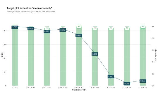
One might also wonder to which extend these approaches are different from simply looking at the target’s ratio’s over values of a certain feature based on observing the training set directly. Indeed, pdpbox also provides an implementation to create such “information plots”:
X_joint = X_train.copy()
X_joint['target'] = y_train

fig, axes, summary_df = info_plots.target_plot(
    df=X_joint, feature='mean concavity', feature_name='mean concavity', target='target'
)
_ = axes['bar_ax']
Which can be created based on the predicted values as well:
X_joint = X_train.copy()
X_joint['target'] = y_train

fig, axes, summary_df = info_plots.actual_plot(
    model=model, X=X_train, feature='mean concavity', feature_name='mean concavity', predict_kwds={}
)
_ = axes['bar_ax']
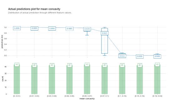
Then why use partial dependence plots? One aspect concerns the idea of looking at effects the model has picked up, rather than directly looking at the data. A holistic approach consists of performing the comparison both on the data and model level and contrasting the results. Another difference between a standard partial dependence plot and an “actual predictions information plot” is that a partial dependence plot shows “marginal effects”, i.e. the values on the y-axis are normalized so that effects of variables can be compared across partial dependence plots – though the actual difference is indeed quite small.
Finally, one might wonder whether this approach (as well as feature importance rankings) should be performed on the training (as done here) or test data split. The answer is quite nuanced in the sense that “it depends” and a case can be made for both [9]! Typically, one should inspect both splits for a complete analysis. The training data reveals insights on what the model has picked up, whereas inspecting the results on the test set gives insights towards how generalizable these patterns are.
Shapley plots
Finally, another tool that is becoming quite popular recently is SHapley Additive exPlanations. The basic idea is that each feature value of an instance contributes to the final outcome. Shapley plots are based on game theory and assess to which degree the outcome can be attribute to each feature. The Shapley value for a feature under observation will hence entail the value that this feature contributed compared to the average prediction over the data set. An intuitive way to understand the Shapley value is as follows: assume a setup where features are looked at in a random order, and each contribute to the predicted value. The Shapley value of a feature is the average change in the prediction that the ensemble formed by the features so far receives when the feature joins it. Note that this entails a hard problem computationally-wise, as we need to consider all possible “ensembles” of features and all possible remaining features that can be added to it, so that efficient implementations end up using a Monte Carlo sampling-based approach [10]. An approximate summary boils down to the following. To calculate Shapley value for an instance and feature under observation, we sample n other instances from the data set. For each such instance, we create two new instances where one consists of the instance under observation, but with a random number of feature values replaced by the values of the randomly chosen instance, except for the feature under observation. The other created instance is the same, except that the feature under observation is set to the value of the randomly sampled instance. The two instances hence differ only based on one feature. Next, the difference in predictive outputs is calculated, and averaged over the n repeats we perform.
Shapley values are a robust mechanism to assess the importance of each feature to reach an output, and hence form a better alternative to standard feature importance mechanisms. In addition, the value also indicates the direction the feature pushes the output from the average prediction (higher or lower).
The most common implementation is provided by the SHAP library:
import shap
shap.initjs()
explainer = shap.TreeExplainer(model)
shap_values = explainer.shap_values(X_test)
shap.force_plot(explainer.expected_value[1], shap_values[1][20,:], X_test.iloc[20,:])

We can clearly see the features that contribute the most to the final output for this instance. Note that this is in line with the analysis we performed based on permuting features above.
To get an overview of which features are most important for a model on a global level, we can plot the SHAP values of every feature for every sample. The plot below sorts features by the sum of SHAP value magnitudes over all samples and uses SHAP values to show the distribution of the impacts each feature has on the model output:
shap.summary_plot(shap_values[1], X_test, plot_type='dot')
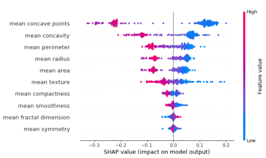
Shapley values have many appealing properties: they can be used for explanations on an instance and global level, and ensures that the differences between the prediction and average prediction is fairly distributed among the feature values of an instance, and is more robustly underbuilt with a theoretical framework compared to e.g. LIME.
Drawbacks of this technique include being computationally difficult to compute, and the possibility to misunderstand Shapley values. The value does not correspond with the difference of the predicted value after removing the feature from the model. (This is quite different from a LIME-based approach where coefficients of a regressor are inspected.) Additionally, Shapley values are based on the complete feature set used to construct the model, which might make it difficult to create explanations that are sparse (see the “LIME” section above.) Additionally, Shapley values do not return an underlying white-box prediction model like LIME does, meaning that it is hard to make statements about changes in the predicted output given (small) changes in the input, though such insights can nevertheless be obtained by the black-box model directly.
Finally, like many other methods above, Shapley values might end up being incorrectly estimated when features are correlated or interact with one another. (The reason for this is because Shapley too permutates on a single feature, given the process above.) It is possible to modify this approach to permute more than one feature, though this is still very much an open question in terms how this influences the analysis and interpretation.
Conclusion
In this article, we have taken a look at some common interpretability checks and tools which should be included in the arsenal of any data scientist. They each come with particular intricacies and should be carefully applied. However, having a good grasp on their workings will enable to bridge the gap between black-box models and understandability, and will help to gain trust from end users. If you want to read up on other interpretability approaches and tools, we definitely recommend this online book by Christoph Molnar.
References
- [1]: Turner, R. “A Model Explanation System”, http://www.blackboxworkshop.org/pdf/Turner2015_MES.pdf
- [2]: Koh, Pang Wei, and Percy Liang. “Understanding black-box predictions via influence functions.” arXiv preprint arXiv:1703.04730 (2017).
- [3]: Goodfellow, Ian J., Jonathon Shlens, and Christian Szegedy. “Explaining and harnessing adversarial examples.” arXiv preprint arXiv:1412.6572 (2014).
- [4]: Martens, David, and Foster Provost. “Explaining data-driven document classifications.” (2014).
- [5]: Ribeiro, Marco Tulio, Sameer Singh, and Carlos Guestrin. “Why should I trust you?: Explaining the predictions of any classifier.” Proceedings of the 22nd ACM SIGKDD international conference on knowledge discovery and data mining. ACM (2016).
- [6]: See https://explained.ai/rf-importance/#3
- [7]: Friedman, Jerome H, and Bogdan E Popescu. “Predictive learning via rule ensembles.” The Annals of Applied Statistics. JSTOR, 916–54. (2008).
- [8]: See http://blog.macuyiko.com/post/2019/discovering-interaction-effects-in-ensemble-models.html
- [9]: See https://christophm.github.io/interpretable-ml-book/feature-importance.html#feature-importance-data
- [10]: Štrumbelj, Erik, and Igor Kononenko. “Explaining prediction models and individual predictions with feature contributions.” Knowledge and information systems 41.3 (2014): 647-665.