
This article first appeared in Data Science Briefings, the DataMiningApps newsletter. Subscribe now for free if you want to be the first to receive our feature articles, or follow us @DataMiningApps. Do you also wish to contribute to Data Science Briefings? Shoot us an e-mail over at briefings@dataminingapps.com and let’s get in touch!
Contributed by: Bart Baesens. This article was adopted from our Customer Lifetime Value Modeling book. Check out clvbook.com to learn more.
One of the most popular and probably easiest ways to do customer analysis is analyzing how your customers use your website. More specifically, the idea of navigation analysis is to understand how users navigate through your web site and whether they can easily find what they are looking for. This can be done using data gathered via web server log, JavaScript page tagging and/or cookies.
A first way of doing navigation analysis is path analysis which is based on the analysis of frequent navigation paths. The key question to be answered here is: from a given page, which other pages do users or groups of users visit next in x% of the times? We obviously assume here that users follow a linear path which is not always the case since a user may go back or forth, have different tabs open, etc.
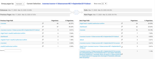
In the figure above you can see path analysis illustrated in Google Analytics. In the top rectangle, you can see the about page of our BlueCourses Basic Credit Risk Modeling course (see www.bluecourses.com). Below you can see how many people directly entered through that page, about 32%, and how many were on a previous page before, about 68%. You also see how many exited after having seen that page, around 40%, and how many went on to another page, about 60%. In the table below, to the left, you can see the pages people viewed before the page we are analyzing, and to the right, the next page in their path. You can click on any page you see in the report, on the left or right, to then analyze that page. You also have the option to click on the name of the page you’re currently analyzing in the top red rectangle and then search for another page.
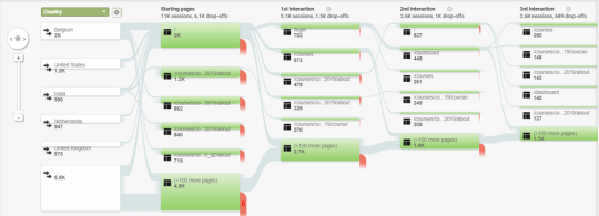
In the figure above, you can see another example of path analysis in Google Analytics. It is called a users flow report and is a graphical representation of the paths users follow through your site, from the source, through the various pages, and where along their paths they exited your site. At the top left, you can see that we are interested in looking at differences between navigation paths of visitors from different countries. You can easily use other criteria such as acquisition channel, new versus return visitor, marketing campaign, type of browser, etc. In this report, you see nodes which represent pages and connections which represent navigating from one page to another. The size of the nodes and connections are proportional to the number of visitors. The red colored parts represent leakage or visitors dropping out after having seen that page. The report is interactive, allowing you to highlight different navigation paths to see the flow for those sections without losing sight of the overall navigation picture.
Another way of doing navigation analysis is funnel analysis. The idea of funnel analysis is to define a predetermined sequence of pages and then measure entry and exit at each stage. The end-stage of the funnel usually represents a conversion such as a purchase, collected lead, etc. In other words, funnel analysis is a method of understanding the steps required to reach a conversion on your website and how many users get through each of the previous steps. The set of steps is referred to as a “funnel” because the typical shape visualizing the flow of users is similar to a funnel which you use in your kitchen. Funnels can be defined for different time horizons, such as for one visit or across several visits spread in time. The latter obviously assumes identification of users across sessions using for example persistent cookies.
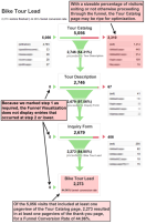
In the figure above (taken from https://neilpatel.com/blog/conversion-funnel-survival-guide/) you can see an example of a funnel plot. It concerns a web site selling personalized bike tours and a conversion is defined as a collected bike tour lead. The first step is selecting a bike tour from the tour catalog. To the left of the first step in this funnel, you can see the entrance or referral pages, to the right you can see the exit pages. Out of the 5056 that visited the tour catalog, 2746 moved on to the next stage in the funnel which is the tour description. You can note quite a bit of leakage after this first step, so the Tour Catalog page may be ready for optimization. Do note that since step 1 of the funnel was defined as required, we do not have entries that occur at lower steps. From the Tour Description page, you can see how many move on to the inquiry form page and from there onward to the Bike Tour lead page which represents a conversion. 2273 visitors converted which represents a 44.96% funnel conversion rate.
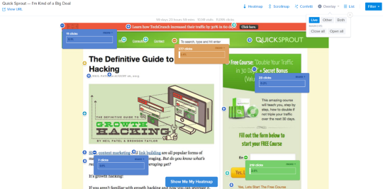
Next, the above figure (taken from https://www.crazyegg.com/overlay) illustrates a page overlay or click density analysis report. The plot lets you drill down on the clicks on every single element of a web page. The clicks can be combined with any other metric of interest such as conversion rates, bounce rates, time on site, etc, which are also overlaid directly on the actual pages. You can also see if users clicked on non-clickable areas in which case you might want to consider adding a link. A page overlay report allows you to traverse through your web site as a group of users navigated through it.
A heatmap gives a coloured representation of a website based upon the intensity of a certain event of interest. Popular examples are clicking, scrolling or moving the mouse. Let’s give some examples.
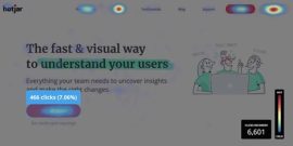
Here, you can see an example of a click map. Click maps illustrate where visitors click their mouse on desktop devices or tap their finger on mobile devices, in the latter case they are sometimes referred to as touch heatmaps. The map is colored from red, which represents high intensity of clicking or hot, to blue, which represents low intensity of clicking or cold.
![]()
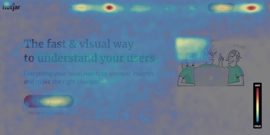
Another variant of a heat map is a scroll map (as shown above, taken from https://www.hotjar.com/heatmaps/). A scroll map illustrates how far down the page people scroll. It’s again colored from red, which represents high intensity of scrolling, to blue, which represents low intensity of scrolling. In this example, you can immediately spot two sharp color changes: one at the top of the page (from red to yellow), and one three quarters down the page (from green to dark blue). It could be worthwhile to investigate these exact locations to see why people stop scrolling after reaching these specific points.
Finally, a move map (as shown above, taken from https://www.hotjar.com/heatmaps/) tracks where users move and pause their mouse as they navigate the page. The hot or red spots represent where users pause their mouse, and research suggests a correlation between where people are looking and where their mouse is—meaning that a move map gives you an indication of where people are looking at as they navigate your page. Hence, this is very useful information to optimize your web page design, think about ad or banner placement for example.
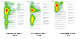
Also as discussed by Shi and Trusov (see https://pubsonline.informs.org/doi/abs/10.1287/mksc.2020.1253), heatmaps can be derived from eye-tracking devices to understand how consumers interact with search engines. An interesting insight from this is that the search goal, among others, impacts how people inspect the search results. The visual inspection scopes are illustrated in the figure below for transactional search, informational search and navigational search. In this figure, warmer colors represent greater concentration of attention. Although eye-tracking devices are still only used in experimental settings, it might become an important source of data in the future if smart glasses and wearables become more widespread.
As with any type of web analytics, also with navigation analysis, it is recommended practice to apply segmentation where possible. For example, investigate differences between navigation behavior of all visitors versus search traffic visitors, across geographical regions, converters versus non-converters, and desktop versus mobile devices. The latter allows you to see if your website performs well on different devices. Content that is prominent on a desktop device might sit much further down on an iPhone and you need to see if navigation and interaction differ and what’s the impact thereof.