
Contributed by: Bart Baesens, Seppe vanden Broucke
This article first appeared in Data Science Briefings, the DataMiningApps newsletter. Subscribe now for free if you want to be the first to receive our feature articles, or follow us @DataMiningApps. Do you also wish to contribute to Data Science Briefings? Shoot us an e-mail over at briefings@dataminingapps.com and let’s get in touch!
- t-SNE stands for Distributed Stochastic Neighbor Embedding and was developed by van der Maaten and Hinton in “L.J.P. van der Maaten and G.E. Hinton, Visualizing High-Dimensional Data Using t-SNE, Journal of Machine Learning Research, 9(Nov):2579-2605, 2008.” Essentially t-SNE is a dimensionality reduction technique, comparable to principal component analysis or PCA. Hence, it could also be considered as a feature engineering alternative. However, PCA is a linear dimension reduction technique that seeks to maximize variance and preserves large pairwise distances. In other words, things that are different end up far apart. This can lead to suboptimal reduction with non-linear data. On the contrary, t-SNE seeks to preserve local similarities by focusing on small pairwise distances.
More specifically, t-SNE is a non-linear dimensionality reduction technique based on manifold learning. It assumes that the data points lie on an embedded non-linear manifold within a higher-dimensional space. A manifold is a topological space that locally resembles a Euclidean space near each data point. Examples are a 2 dimensional manifold, locally resembling a Euclidean plane near each point, or a 3D surface which can be described by a collection of such 2 dimensional manifolds. A higher dimensional space can thus be well “embedded” in a lower dimensional space. Other manifold reduction techniques are multidimensional scaling, isomap, locally linear embedding and auto-encoders.
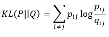
t-SNE works in 2 steps. In step 1, a probability distribution representing a similarity measure over pairs of high-dimensional data points is constructed. In Step 2, a similar probability distribution over the data points in the low-dimensional map is constructed. The Kullback–Leibler divergence (also known as information gain or relative entropy) between the 2 distributions is then minimized. Remember that the Kullback–Leibler divergence is a measure of similarity between two probability distributions.
Let’s first elaborate on step 1. We start by measuring the similarities between data points in the high dimensional space. The similarity of xj to xi is the conditional probability, pj|i that xi would pick xj as its neighbor if the neighbors were picked in proportion to their probability density assuming a Gaussian centered at xi. We then measure the density of all other data points under a Gaussian distribution and normalize to make sure the probabilities sum to 1:
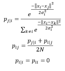
Note that pij represents the joint probabilities which can be obtained by summing both conditional probabilities and dividing by 2 times N. N indicates the dimensionality of the original data points. Note also that since we are only interested in modeling pairwise similarities, we set the value of pi|i and pii to zero.
You can see this illustrated below. Suppose we have 3 data points: xi, xj and xk. We then compute the conditional and joint probabilities using the formulas to the left. For the 2D example shown here, N equals 2.
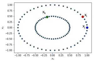
We start by defining a Gaussian distribution centered at xi. Note that we hereby use the Euclidean distance. We can now plot this distribution around data point i.
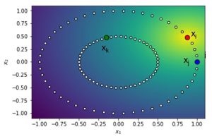
You can see this illustrated here. Note that the yellow area around xi represents the centre of the Gaussian distribution. We can then calculate the probabilities and find that pj|i equals 0.78/z and pk|i equals 0.6/z. z represents the normalization term to make sure the probabilities sum to 1. In other words, it represents the denominator in the equation above. We can the normalize the distance values for every k different from i. pj|i then becomes 0.78/55.62 or 0.01. We can now compute two joint probabilities pij and pik as follows:
- pij = 0.0069
- pik = 0.0049
From the calculations, it is clear that xi and xj are more similar than xi and xk.
Before we proceed to step 2, let’s briefly revisit our Gaussian kernel that we used:
First, note that it uses the Euclidean distance. Furthermore, the bandwidth of the Gaussian kernel, sigma, is data point-dependent. It is set based upon the perplexity which is a measure to estimate how well the distribution predicts a sample. σi is then set in such a way that the perplexity of the conditional distribution equals a predefined perplexity using the bisection method. We refer to the original paper for more information about the latter. As a result, the bandwidth parameter σi is adapted to the density of the data: smaller values are used in denser parts of the data space. This is one of the key user-specified hyper parameters of t-SNE.
We are now ready to proceed to step 2 of t-SNE. Here, we measure the similarities between the data points in the low dimensional space. In other words, we now calculate qij between the mapped data points yi, yj, etc. in the low dimensional space. A Student’s t distribution is used to measure the similarities with the degrees of freedom equal to the dimensionality in the mapped space minus 1. The reason we use a Student’s t distribution is because of the fact that it has fatter tails than a Gaussian distribution, hereby representing a bigger uncertainty because of the mapping. Again, we set qii equal to zero. Also note that, as opposed to step 1, we don’t have a perplexity parameter here.
We are now ready to quantify the distances between pij and qij. qij obviously depends on the locations of the data points in the mapped space. These locations of the data points in the mapped space are determined by minimizing the Kullback-Leibler divergence:
The optimization can be performed using a standard gradient descent algorithm.
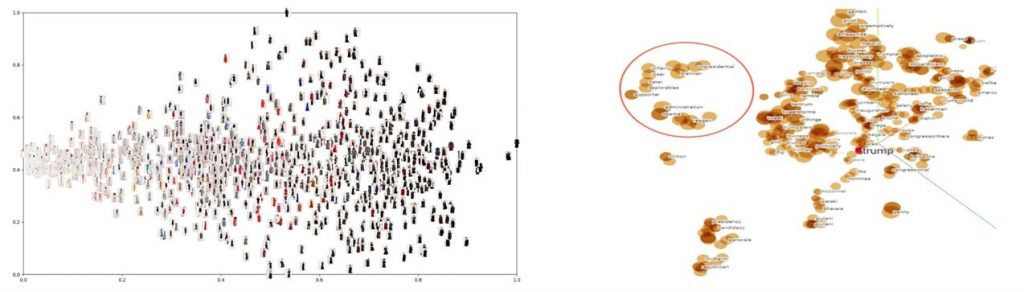
Below you can see an example of the workings of t-SNE. It especially works well when dealing with high dimensional data, such as images or word documents.
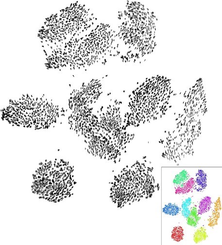
However, do note that t-SNE in itself is not a clustering technique. A 2-level clustering can however be easily performed on the mapped space, using for example, k-means clustering, DBSCAN or other clustering techniques. You can see this illustrated below. The black dots represent the data in the mapped space. Below you see the results of a k-means clustering with the colors representing the clusters.
Most implementations of t-SNE only allow the lower-dimensional space to be 2D or 3D. Essentially, t-SNE learns a non-parametric mapping. In other words, there is no explicit function that maps the data form the original input space to the map. Hence, it is not possible to embed new test points in an already existing map. This makes t-SNE good for exploratory data analysis, but less suitable as a dimensionality reduction technique in a predictive pipeline setup. Note however, that extensions exist that learn a multivariate regressor to predict the map location from the input data or construct a regressor that minimizes the t-SNE loss directly, e.g. by means of a neural network architecture.
Also note that it is possible to provide your own pairwise similarity matrix and run the KL-minimization routine, instead of using the built-in conditional probability based similarity measure. The requirement is that the diagonal elements should be zero and the matrix elements should be normalized to sum to 1. A distance matrix can also be used as it can easily be transformed in a similarity matrix as similarity = 1 – distance. This could avoid to tune the perplexity parameter although obviously a similarity metric should be properly defined.
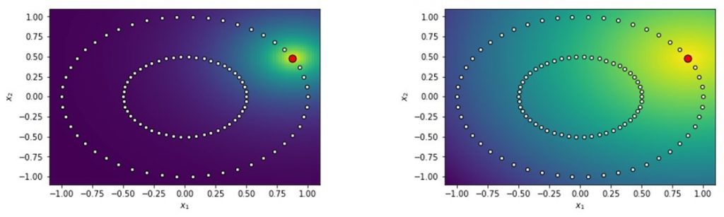
As t-SNE uses a gradient descent based approach, the general remarks regarding learning rates and initialization of mapped points apply. The initialization is sometimes done by using Principal Component Analysis, but do note that the default settings usually work well. The most important parameter is the perplexity, as we already mentioned before. The perplexity can be viewed as a knob that sets the number of effective nearest neighbors, similar to the k in k-nearest neighbors. As said, it depends on the density of the data. A denser data set requires a larger perplexity. Typical values range between 5 and 50.
Below you can see the impact of the perplexity illustrated. As said, it quantifies the neighborhood effectively considered. In the figure to the left, you can see a low perplexity, whereas in the figure to the right a higher perplexity has been set.
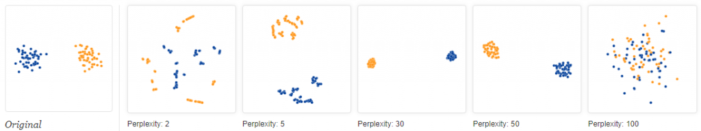
Obviously, different perplexity values can lead to very different results. You can see this illustrated below. To the left, you can see the original data set. You can then see the results of applying t-SNE with perplexity values of 2, 5, 30, 50 and 100 (image from https://distill.pub/2016/misread-tsne/).
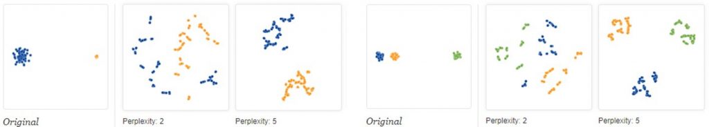
Note that the size of the clusters has no meaning, neither does the distance between clusters. You can see both illustrated below (image from https://distill.pub/2016/misread-tsne/).
Although t-SNE is a very useful tool for visualizing high-dimensional data, t-SNE plots can sometimes also be misleading. In other words, random data can end up looking meaningful. Examples of this can be found on https://distill.pub/2016/misread-tsne/.
Here you can see some references to implementations of t-SNE:
- Matlab (original release): https://lvdmaaten.github.io/tsne/ (now built-in in Matlab)
- R (tsne package): https://cran.r-project.org/web/packages/tsne/
- Python (sklearn): https://scikit-learn.org/stable/modules/generated/sklearn.manifold.TSNE.html
- Julia, Java, Torch implementations also available
- Parametric version: https://github.com/kylemcdonald/Parametric-t-SNE